Title page designer: Jasmine Mansbridge
Today I'm pleased to introduce Jasmine Mansbridge, who designed the title page for the interview with Nancybird founder and designer Emily Wright in Conversations with Creative Women: Volume Two.
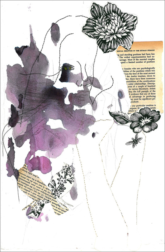
What is your art/design/career background? I started painting when I was seventeen and it is something I truly love doing. In March this year I had a solo exhibition in New York, which was a real highlight for me. I often spend time drawing and playing around with a pencil and paper and this is how my ideas develop.
What drew you to the work of your interviewee, Emily Wright of Nancybird? I moved to Victoria three years ago, and one of the first things I did was visit the NGV, where I first saw Emily's Nancy Bird products. I loved them for their quality and original aesthetic. I purchased my first Nancy Bird bag not long after that and I still use it most days. It is practical and still looks as good as new. So, It was a wonderful feeling, and a privilege to be given the opportunity to illustrate for Emily. Probably about time for a new one though??!
Tell us about the development of your title page design and how you arrived at your concept. I drew up four rough designs before visiting Emily in her Northcote studio, I wanted to get a visual of her and her space and (most importantly) get her opinion on what she thought suited best with her brand. We chatted about the elements she liked best and this gave me direction for the final illustration. I loved the collaborative aspect of the design process and the input she gave me was very helpful.
What materials or computer programs did you use to create the title page, and how did you then prepare it to be submitted for the book? I simply used pencil, pen and acrylic paint to create my design. I like the good old fashioned approach to art making, and truthfully, I never learnt to do anything clever on a computer and so it's all I have to work with anyhow.
What other fun projects are your working on now? Right now and am busy creating work for a solo exhibition at the Rtist Gallery in Prahran in March 2014! I like being busy and always have a painting on the go. I feel blessed to be able to be doing something I love.
Title page designer: Nikki Donald
Nikki Donald has a raft of skills - interior design educator, artist, textile designer and... Conversations with Creative Women: Volume Two title page illustrator! Nikki took on the task of illustrating a title page for Georgia Hobart of Hobes. Today we chat about the design and her larger body of work...
What is your art/design/career background? From sign-writing, graphic design, design education and now surface art and design - it keeps evolving! I love doing things by hand and on the computer.
What drew you to the work of your interviewee? Anyone who designs something shiny in leopard print (for example, the Sparkler Hobe) is my friend for life! I'm also really inspired by Georgia's leap of faith in starting her brand - it encourages me to keep focused on my design dream!
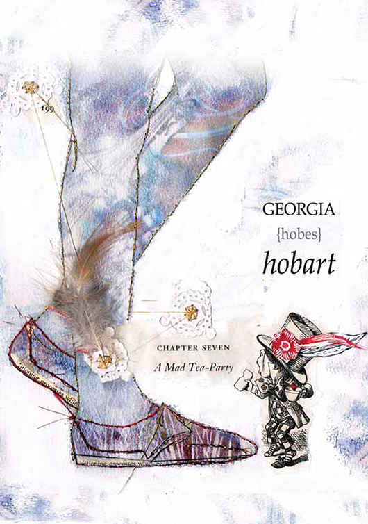
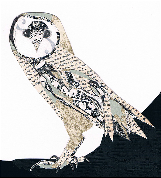
Tell us about the development of your title page design and how you arrived at your concept. Oh...I'm so bad at this! I'm really, ummm, "organic". Seriously, I just immerse myself in my subject matter and start playing with my favourite materials - papers, feathers, thread and stitching and a bit of mixed media. I always work on 3 or 4 ideas at the same time then see how they evolve. I LOVED doing this project - I was obsessed, every night for about 2 weeks I just played with the materials. It always comes together, and I've learned to trust the process and really enjoy it, not just the end result.
What materials or computer programs did you use to create the title page, and how did you then prepare it to be submitted for the book? I got the Mad Hatter from an old copy of Through the Looking Glass and the shoes are a photo from Georgia's website which I traced onto watercolour. The background colour is mixed media: pearlescent ink and bleach. I've also used some old wallpaper in there...um, I think there's a bit of a paper doily as well, ha ha! Then finished off with some metallic thread which I've hand stitched. I scanned the image into Photoshop and added the text, just really simple as there's alot going on in the image itself.
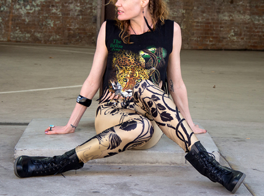
What other fun projects are your working on now? LEGGINGS! Part of my business, Coup De Foudre, is a fashion range called Art For Your Ass. I'm about to start work on the summer range - some long tube skirts, singlet dresses and maybe some cozzies.
Title page designer: Carli Hyland
Carli Hyland designed the title page for the interview with photographer Olga Bennett in our new book Conversations with Creative Women: Volume Two, and today we find out a little more about her...
What is your art/design/career background? I initially studied a Bachelor of Visual Arts with a focus on Photography and Printmaking. Afterwards I was drawn to graphic design as an application of the skills and methods I learnt during my Bachelor. Over the last seven years I have been moving between Australia and The Netherlands where I have been working with numerous and diverse clients. Now I am based in Denmark and I have a business called Studio HyHy.
Studio HyHy is a graphic design studio focused on tactility and simplicity. We combine old school and digital techniques to produce beautifully crafted products, anything from a poster, publication or website.
What drew you to the work of your interviewee? Coming from a photographic background I was naturally attracted to Olga's work. The simplicity in her photographs is poetic and powerful and in many ways also quite graphic.
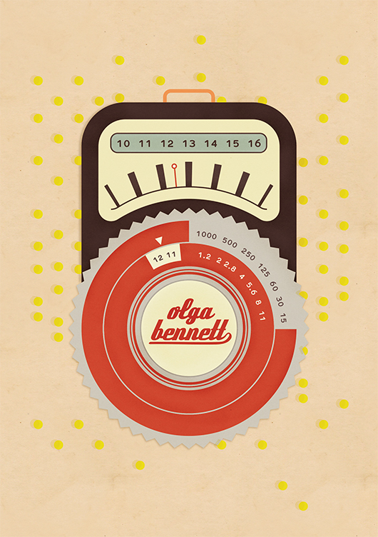
Tell us about the development of your title page design and how you arrived at your concept. I started out with the idea to create a hand water-coloured bokeh effect to blend with the typography of her name. Olga photographs many artists in their studios and I thought it would be interesting to bring in this tactility to the title page. After a few experiments I decided it wasn't really working out so I moved to a more graphic approach and created a retro style light meter. In this way I focused more on the process and technique and let her work speak for itself.
What materials or computer programs did you use to create the title page, and how did you then prepare it to be submitted for the book? For the most part I created the design in Illustrator, I did a bit of hunting around for the right retro style typeface and the final step was in Photoshop where I added a bit of texture to different elements of the design. When I start a design I always check for the technical aspects first and create a blank document accordingly, so then you don't have to migrate it over the final stage.
What other fun projects are your working on now? In August I started working full time with the great folks at Sustainia. Sustainia is part of the Danish think tank Mandagmorgen. We work on bringing together research and solutions around sustainability and communicate them to a broad audience. As the Sustainia graphic designer, I am kept busy with our many publications plus promotional materials and presentations.
Thanks Carli! You can read the interview with photographer Olga Bennett in our new book, now available in paperback and digital form.
Title page designer: Emma Rickards
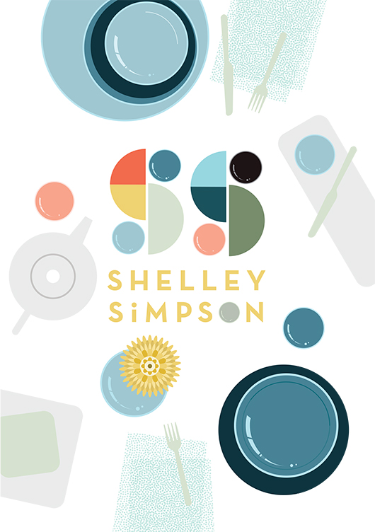
To have illustrator Emma Rickards design the title page for Shelley Simpson in 'Conversations with Creative Women: Volume Two' was a no-brainer - Emma is a big fan (and collector) of Shelley's ceramic wares, and both artist's love and celebration of colour, shape and line is evident in their respective work. Today we chat to Emma about her background and how she created the title page design for Shelley's interview.

What is your design background? I originally trained as an art teacher many moons ago, and taught secondary school art and design for ten years. During that time, I also completed a Graduate Diploma in Graphic Design at RMIT. I wanted to see what it was like to work on my own projects, and to spend time ‘doing’ rather than giving myself completely to teaching. Shortly after, I left the classroom in search of new adventures, and began working on my own graphic design projects, lecturing in Art Education at The University of Melbourne and studying a Master of Design at Swinburne Uni. Nowadays, I combine lecturing and graphic design with raising two children, and life is completely bonkers.
What drew you to the work of Shelley Simpson? I’ve been a huge fan of Shelley’s tableware range Mud Australia for some time now, and I’m the lucky owner of a small collection of Mud bowels, plates and cups. Well, it’s an even smaller collection since my husband knocked one off the shelf last month, but let’s not revisit the horror. So naturally, I was keen to celebrate the creator of a product I loved. I knew the simple forms and delicious colour palette of Mud would suit my illustrative style, and I’m also going through a ‘bird’s-eye view of tabletops’ phase at the moment, so the subject matter fit like a glove.
How did you develop your title page design, and arrive at the final concept? I began by compiling a Mud Australia Pinterest board full of lavishly styled shots of past collections, together with bird’s-eye pics of food and table arrangements. These images were referenced as I sketched possible page layouts, and considered how tableware pieces could be arranged into typographic forms. Once on the computer, I also considered stamping Shelley’s name onto a napkin or tablecloth, or creating the letterforms from noodles or spaghetti shapes. Superfluous drawings of food and distracting patterns were slowly discarded in favour of a design where Shelley’s creations could take centre stage. Symmetrical layouts gave way to more scattered, dynamic designs, while a centrally placed tray presented itself as the perfect spot for a title. As an asian-style meal evolved on the screen, ‘Shelley’ took shape from grains of rice, while ‘Simpson’ grew from a sympathetic typeface called Trend. A colour palette was chosen to reflect past Mud collections, with blue tones used to ‘quieten’ the busy scene, and warm accents providing some punch & pop.
What materials/computer programs did you use, and how did you prepare it for the book? Shelley’s title page was created using the Pen, Shape, Gradient & Type tools in Adobe Illustrator and the computer mouse, plain and simple! I’ll often trace a scanned sketch when developing an illustration, but this piece evolved as I played with the relationships of elements, and established a sense of movement, hierarchy and harmony.
What other fun projects are you working on now? I’m currently teaching Visual Art Education as part of the Master of Teaching: Secondary program at The University of Melbourne. It’s fun and challenging in equal parts, thanks to the juggle of mothering small children and having to turn up each week with my brain intact, clothes on and content prepared. I also create classroom resources (booklets, posters, teacher’s notes and a short movie) for teachers of Visual Communication Design, and sell these via my website. I’m really passionate about design education in secondary schools, and I love providing teachers with beautifully designed and useful stuff that will make their job that little bit easier. There are also some illustrated family portraits waiting to be completed in the lead up to Christmas. After that, I might sit on the couch for a couple of nights and watch reruns of The Bachelor.
You'll have to get the book to see the stunning result Emma created for Shelley's interview! Find it online or instore here.
Conversations with Creative Women: Volume Two - a big thank you...
What a weekend! Conversations with Creative Women: Volume Two was officially launched, and good fun was had by all.
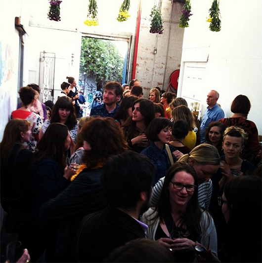
The Launch!
We raised $500 for Seven Women via our mammoth raffle, and our taste buds were tantalised thanks to our generous sponsors Ben Haines Wine, Two Birds Brewing and Sweet Valentyne.
Big thanks to our sponsors Good Grace and Humour for their beautiful floral display - it really made the space at Albert St Studios come alive! And extra high fives to my helpers on the night - Martina Gemmola, Caroline Kennon, Liz Ickiewicz, Sarah Chapman, Sean Box and Amy Vuleta.
Stockists
So now, with the book officially 'launched', where can you find it? Well, apart from purchasing online, the following retailers have copies for sale in their lovely stores:
Melbourne:
Shelley Panton 440 Malvern Road, Prahran VIC (03) 9533 9003
Pieces of Eight Gallery / Edition X 28 Russell Place Melbourne VIC (03) 9663 3641
Craft 31 Flinders Lane Melbourne VIC 03 9650 7775
Perth:
Aspects of Kings Park Fraser Avenue West Perth WA (08) 9480 3900
Sydney:
Follow 380 Cleveland Street Surry Hills NSW 02 8068 2813
Brisbane:
Nook 19 Browning St West End, Brisbane Qld (07) 3255 3589
Adelaide:
Booked at North Adelaide North Adelaide Shopping Village 81 O'Connell Street North Adelaide SA phone: 08 8361 9866
So pop in store and pick up one for your special creative lady friend for Christmas :)
Pre-orders posted
Thanks again to everyone who pre-ordered a copy of the book... if you're based in Australia you should have received your copy by now, and if you're international it has been posted and is on its way.
eBook now available
One last thing... if you're so inclined you can also get Volume Two as an eBook for your iPad, Kindle or as a PDF. Save a tree, save storage space, save money! Ebooks are only available via our online store.
Title page designer: Camille Condon
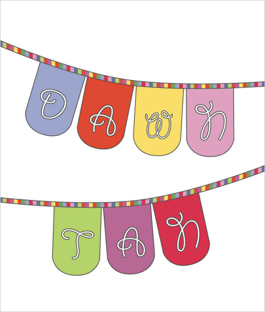
Today we welcome Camille Condon to the blog, who is probably better known around the internet as Ms Curlypops! Cam designed the title page for the interview with illustrator and artist Dawn Tan in our new book Conversations with Creative Women: Volume Two.

What is your art/design/career background? I’m a self taught designer. I studied art through my early high school years, but then chose to focus on maths and science and received a Bachelor Degree in Manufacturing Technology.
The creative bug always remained within, and although manufacturing was my day job, I spent any free time painting, drawing and creating.
A few years ago, I decided to teach myself to sew, which in turn led to an obsession with fabrics. It seemed to be kind of a natural progression to move into the world of fabric design.
What drew you to the work of your interviewee, illustrator and artist Dawn Tan? I’ve been following Dawn’s career online for quite a few years now. I love her playful, joyous sense of style, and of course, I’m drawn to her wonderful use of colour!
Tell us about the development of your title page design and how you arrived at your concept. I really wanted to design a title page which fitted Dawn’s aesthetic while still staying true to my design style. Luckily we both love colour, and I think we both have a really fun style.
What materials or computer programs did you use to create the title page, and how did you then prepare it to be submitted for the book? To create the title page, I really wanted to combine all my creative skills, and I definitely wanted to design a fabric especially for this project.
The concept sketch was designed using Illustrator. I then created another Illustrator file with all of the elements that were needed to create a digitally printed fabric. I fell in love with Dawn’s Native Flower print so I tried to colour match my fabric designs to that print.
The next step was to send my fabric printing file to Frankie and Swiss in Melbourne to have it printed onto their 295gsm 100% cotton canvas base cloth.
Once the fabric arrived in my letterbox, I put my sewing skills to use and turned it into personalised bunting for Dawn. It was then just a matter of photographing and editing to match my initial concept.
Of course, an original concept drawing doesn’t always end up being as perfect as I’d like! I wasn’t happy with the bunting just hanging in a blank space, so I took my finished photo and digitally added a frame. I’m really happy with the end product.
The extra bonus is that I can gift the personalised bunting to Dawn to keep :)
What other fun projects are your working on now? I’m a bit of a multi-tasker, so I’m always working on lots of things at once. I’ve just designed a new fabric which I’m waiting to have printed. I’ve branched out into wallpaper design and I have a new range of brooches featuring my own laser cut designs combined with my wallpapers.
I also have a stall at The Finders Keepers market in Brisbane this weekend!
Well Cam, we'll miss you at our book launch but if you happen to be in Brisbane this weekend, pop along to Finders Keepers and check out her wares. You can also purchase the book at the Follow stall at the market.
Title page designer: Kristen Willis
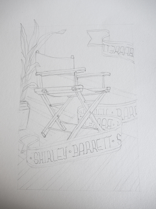
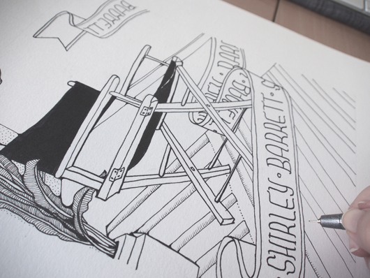
Today we welcome multidiciplinary designer Kristen Willis to the blog, who designed the title page for the interview with film and television director Shirley Barrett in our new book Conversations with Creative Women: Volume Two.
What is your art/design/career background? My creative streak was developed and encouraged from a very early age by playing shop assistant (at 4 years old) in my Nonna's Singer sewing shop. I was constantly exposed to textiles and patterns which dictated creative projects such as drawing all over tables, designing and pattern-making fashion for my dollies and gluing my fingers together crafting paddle-pop structures for my Smurf figurines… The perfect playground for creativity, I was in heaven.
Through my adolescence, fine art became a prominent attribute as I regularly participated in Qld Regional Youth Exhibitions and Competitions. This active envolvement naturally lead to the pursuit of a Bachelor in Visual Arts, majoring with Honours in Printmaking and Drawing in 2006, and enrolment into Shillington College– School of Graphic Design in 2011.
Now as a creative freelancer, I continue to expand my interests by liaising with Graphic Design studios, Creative Contractors and sourcing my own little clientele for those special one-on-one projects.
What drew you to the work of your interviewee, film and television director Shirley Barrett? As an avid follower/junky towards various Australian produced television series, my creative mind exploded at the thought of representing the fantastic film production visionary, Shirley Barrett. What an unbelievable opportunity this is, to show tribute to such a successful industrious icon.
Tell us about the development of your title page design and how you arrived at your concept? With a little background research, black ink and piece of acid-free rag-paper, I decided to hand-draw a highly detailed illustration of a director's chair, prominently placed with in a warm, inviting, eclectic room. This is a celebratory piece, playing tribute to Barrett's creative endeavours and industry achievements.
What materials or computer programs did you use to create the title page, and how did you then prepare it to be submitted for the book? As a mixed-media artist, I literally utilise as many creative platforms as possible. I achieve this by wearing my Printmaker's hat and approach the piece in layers. The composition was initially sketched out in graphite, and then delicately inked in with a fine-tip black marker by hand. The second stage of the process is to scan and digitally colourise the illustration on-screen by using Adobe Photoshop CS6. For this piece I have used both flat colours and textures to create a further sense of depth. The overall outcome is a smooth, clean piece of modern design with a print-art 'touch'. With the click of a button, I was then able save the artwork in a suitable file-type ready for publication.
What other fun projects are you working on now? I have a few really interesting projects on the go right now; such as iPhone graphics for an upcoming zombie game (yes, zombies), illustrative panels for Queensland Museum, art direction and design for a children's storybook, and an ever-going expanding series of illustrative artworks called 'Animalia' which explores the quirky connections between animals and human personality-characteristics.

