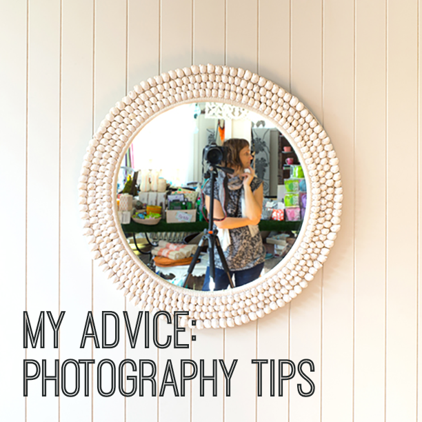
My Advice: Photography Tips
Human beings thrive on the visual, especially those who consider themselves creative. The online world reflects this - today our businesses and creative output is supported by image-heavy blogs, websites, and social media feeds which make it important to represent yourself and your imagery in the best possible way.
This month, I asked three professional photographers for their tips to improve the result when you're tasked with presenting your products or work in the best possible light.
Karina Sharpe, Conceptual Artist and Product Photographer www.karinasharpe.com.au // Instagram // @karina_jean_sharpe
Imagery is big these days, and high calibre imagery has become both the norm and the expectation. I teach a lot of people how to take good photos more effortlessly - and less by accident - in my Benchtop Photography workshops. These are the three tips that people seem to find of most value.
1. The direction of LIGHT, in relation to an object’s position and orientation, can be the single most transformational element of your photographs. This is because objects have a form that will show itself differently depending on how its surfaces are lit up. Begin to notice the light around you and where it is coming from. Try and set your arrangements up on something that you can spin around in relation to the light source. Then, play with how the light falls onto, and across, your objects. Observe what gives the most captivating result.
2. SHADOWS are definitely not your enemy. In most situations we want to engage with our audience on an emotional level, and shadows provide depth, tangibility, realism and substance. However, we want to try and avoid the shadow of one object falling across another object, so become aware and move your objects if shadows are falling in an unfriendly manner. Also, try to avoid double shadows. If you notice this is happening, try to eliminate any extra light sources.
3. Creative use of BACKDROPS allows our images to standout, be recognisable, and build consistency for our brand. Coloured paper or cardboard are easy options, and things like tiles, fabric, flooring offcuts and fake timbers & textures give even more scope. Choose surfaces with your brand’s ethos in mind; timber is not just timber – white-washed might look refined and adventure-y, whereas a dark rough grain would be more earthy and homespun. Ask yourself, which timber am I?
Jessica K Reftel Evans, Photographer www.amorfo.net // Instagram // @amorfophotography

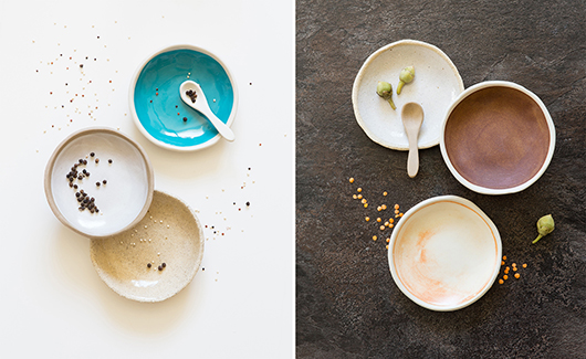
Before setting out on taking your images it's a massive time saver to work out clear visual objectives. Storyboard what it is that you're trying to achieve; a colour palette/mood-board and if you want these images to be more editorial/environmental or clean/factual. Take these thoughts with you as you prepare the shoot with backgrounds and props. Keeping the styling consistent is the key.
To display most products honestly and flatteringly I would suggest using a soft light source. If you don't have special lights you can use a window. Avoid direct sunlight and diffuse the light with a photographic scrim or thin white fabric. If the shadows are too heavy use a white card or another piece of white fabric on the shadow side of your product. Also, turn off your roof lights since they might change the colour temperature and light of your image. The colour of daylight changes throughout the day. So to make sure that your images have consistent and accurate colour representation use white balance settings. This can be done either on your camera or in your image processing software.
And remember, you might not get the perfect image the first time. So just practice, experiment and most importantly have fun. Happy shooting!
Hannah Rose Robinson, photographer www.hannahrose.com.au // Instagram // @hannah_rose_robinson
Tell a story. In today's world we are so bombarded with images everywhere we turn that it's hard to stand out. A visual identity is so important - carving out a style that is unique and becomes a recognisable brand, they tell a story through all the elements involved. Photography is just one element of that but an important one. Use imagery that tells a story, or evokes an emotional response. Put multiple images together to create a mood, or piece together a narrative. Write something to accompany the image/s, tell a story. I want to know what people are about, how they feel, their views on the world. Show your process. This is engaging and people like to be invited into the intimate space you can create with images and words. No matter what the subject matter, food, products, people, how can they be a story. What else is in the picture, what else can help tell my narrative.
Be unique. We are all guilty of scrolling Instagram or a favourite blog and getting tunnel vision on someone else's style when we see an image we fall in love with. Try not to get lost in this. I like to see people be different from the masses, find their own vision. There will always be trends that will come and go, but if you spend some time looking deep and hard on what your core vision and personal brand message is, you should be able to start carving out your own style. Be inspired by the images you like, but don't look to be a copy. Look to what the elements are that you like in those images (maybe it's the light or tone or mood) and be inspired by them to create your own unique look.
Switch off. The online world that we are all so intrinsically plugged into these days is immense. It takes up a lot of our time, we devote it our time, and it demands our time. Our technology and online lives are so ingrained in our experiences these days that it frankly makes my head ache. So my big tip is to switch off. Every now and then just switch it all off. Don't take a picture, don't blog, don't scroll. Go do the things you love to blog about and reconnect with them on a fully present scale. It's easy to miss the essence of a moment, lose sight of the essence of your work- whilst being lost in how to capture and share it. Every now and then, switch off and revaluate the process. Go climb a mountain purely to feel the joy in the ache of your legs, to feel the air sweetly fill your lungs, to drink in that view from the top, be fully present. Don't take a picture. Make a memory, and keep it for yourself. Put them in your bank to inspire you. It reboots your brain, and will only mean great things for all your creative endeavours.

- - - Thank you ladies for sharing your photography tips. I am definitely going to have a play with my camera soon!
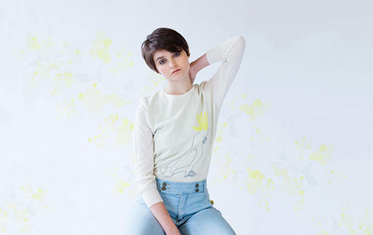
{Title image by Karina Sharpe}
Andrea McArthur (www.andyjane.com) has a passion for all things visual and works as an Art Director and Designer for the Brisbane Festival. Design is her true love and she goes weak at the knees over strategic branding. You’ll find her sharing on Instagram @andyjanemc.

